B2B Signature Platform Redesign
2025
.png)
2025
· Design system architecture · Token-based theming · Component library · Information architecture · Workflow design
Industry
Main activities
Design Systems Thinking
Building design systems that scale with the product. Token architecture, component libraries, and patterns that other designers can build on without breaking what's underneath.
Information Architecture
Restructuring complex products so users find what they need without scanning every line. Hierarchy, prioritization, and surfacing decisions for environments where simple lists stop working.
UI Design
Designing interfaces where every decision serves the system underneath.
A token-based design system for a B2B signature platform built on an enterprise CRM. Turned inherited brand foundations into a scalable architecture.
When brand becomes a system
The Setup
A B2B signature platform redesign that started with a logo and a color palette.
The project was a from-scratch redesign of a B2B digital signature platform — eIDAS-compliant, used by enterprise customers for legally binding document workflows. The product had been in market and was being prepared for a new phase of growth.
What I was given to start with was a brand layer: logo, color palette, typography, and voice, established by a separate studio before I joined. What I was asked to build was everything that sits between brand and product — the system that turns a few visual decisions into a working interface.
I started solo. The team grew later, and other designers built on top of the foundation I'd set. This case study is about how I built that foundation.
Building the System
The system was built in a deliberate order: icons, tokens, components, screens.
The system was built in a deliberate order: icons first, then tokens, then components, then screens. Each layer constrained the one above it, which is what made the system hold together as it grew.
Icons set the visual tone before anything else did. They're the smallest decision that touches every screen — present in nav, in forms, in empty states, in toasts. Choosing an icon library before defining components meant the system had a consistent voice from the moment a button or a field appeared on screen. I selected Remix for its breadth and geometric consistency.
Tokens came next, built on the brand foundations from the prior studio engagement. The token system had three layers. Global tokens held primitive values: brand black, brand white, the full color ramp, type scale, spacing units. Alias tokens described intent rather than value — foreground.1, surface.primary, border.subtle. Component tokens bound aliases to specific UI elements — button.primary.background, dialog.surface, field.border.rest.
The separation did real work. Global tokens could change without touching components. Aliases let the same primitive serve different intents across light and dark contexts. Component tokens kept the library composable — adding a new component meant binding existing aliases, not introducing new primitives.
Components were built as token consumers, not as standalone designs. A button didn't have a hardcoded color; it referenced a token. A dialog didn't have a hardcoded surface; it referenced a token. The library covered the patterns the product actually needed: buttons and toggles, dialogs, fields, date pickers, message bars, toasts, text areas.
Screens came last. By the time the first product surfaces were designed, the system underneath them was already stable. The screens demonstrated the system rather than driving it.
.png)
.png)
.png)
.png)
.png)
.png)
.png)
.png)
.png)

The System in Practice
Three surfaces, three different problems, one system underneath.
Three surfaces show how the system held up when it had to do real work. Each is a different kind of problem, and each leans on the same tokens, components, and logic underneath.
Signature Creation. A signature can be saved, drawn, typed, or imported from a device, URL, or cloud storage. The challenge wasn't the variety — it was making the variety feel like one decision instead of seven. I structured the flow as a single tabbed surface, with the import path expanding inline rather than branching into a separate screen.
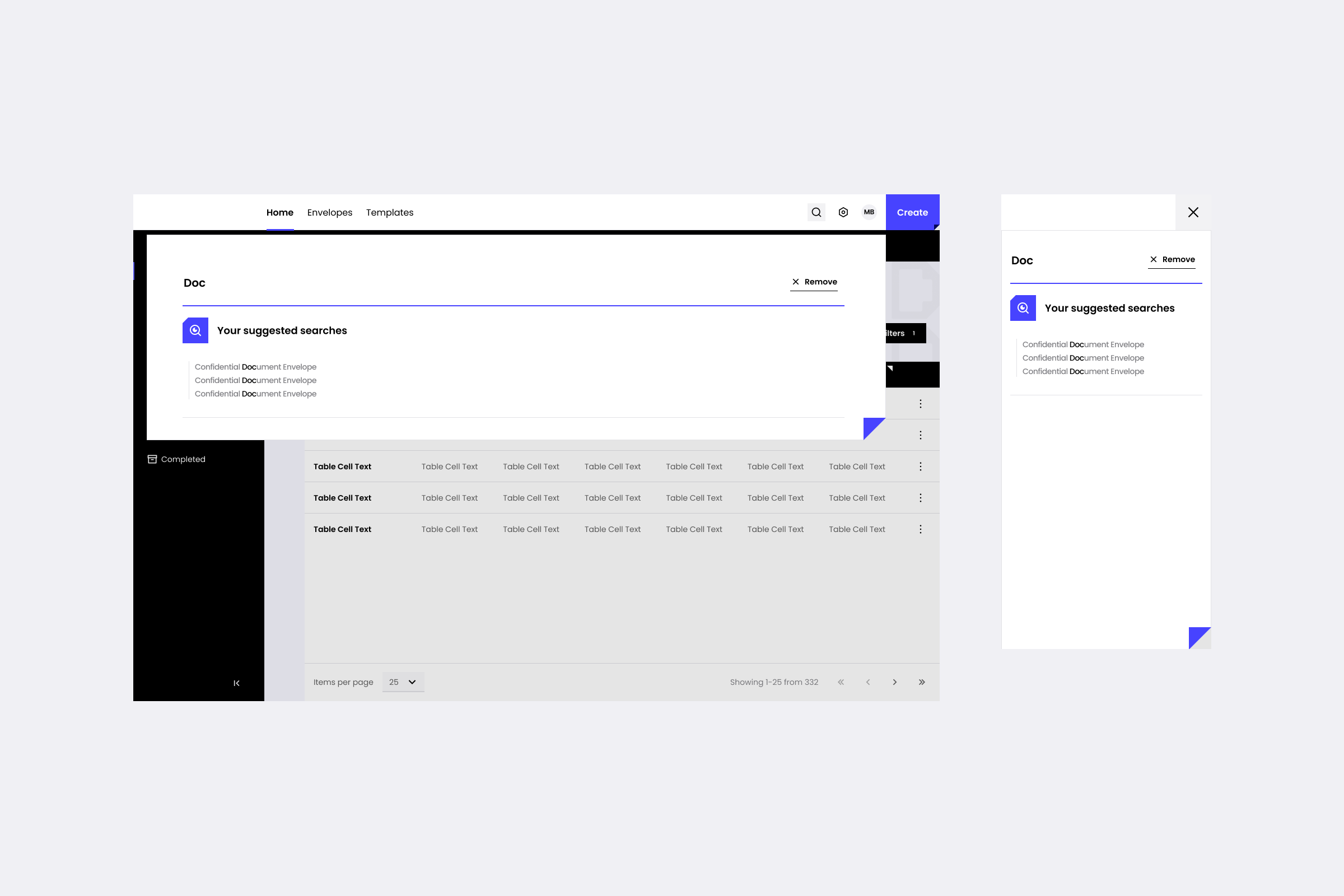
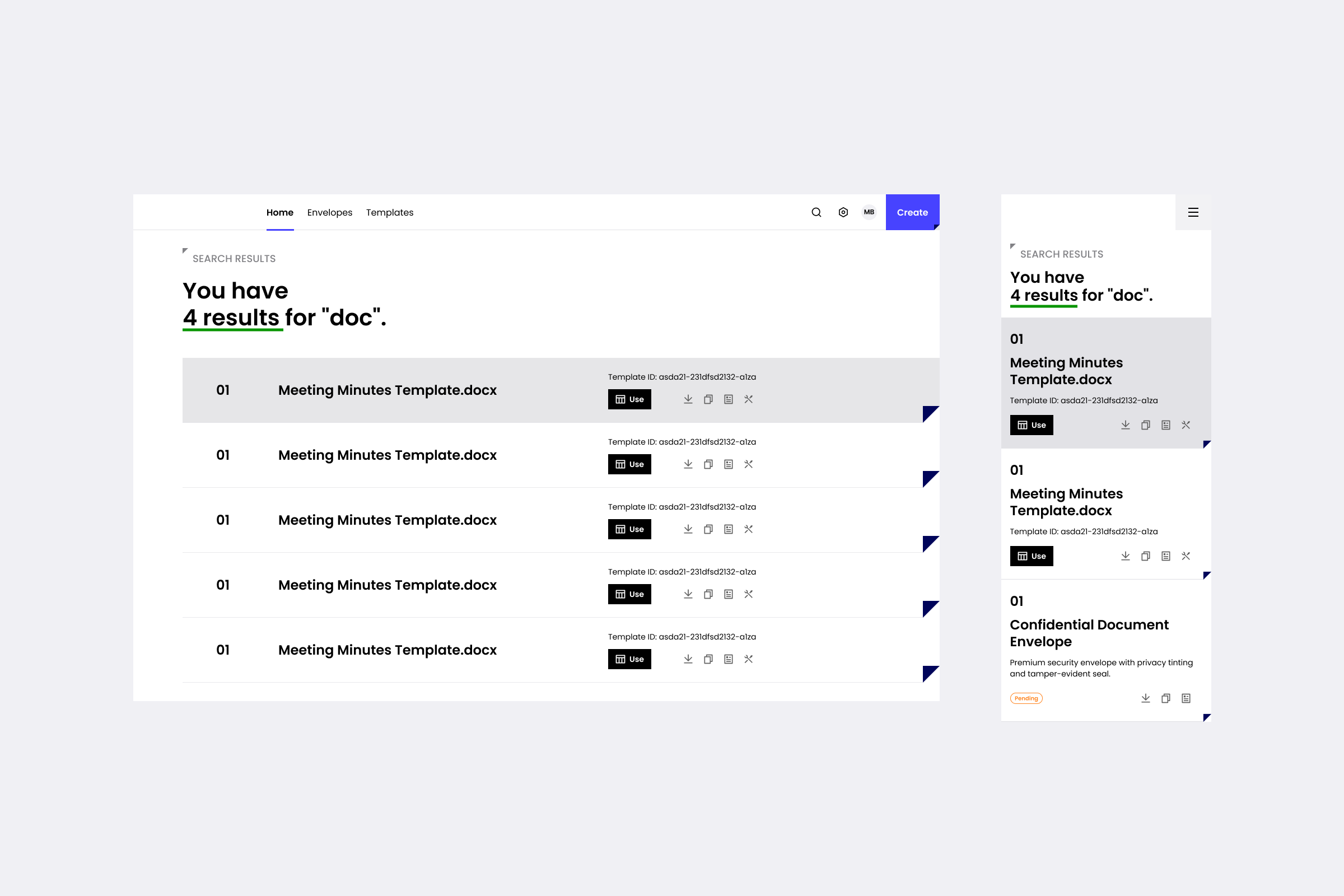
Search. For a high-volume environment, search isn't a feature — it's the primary way users find anything. I designed it as an overlay that opens with three regions visible immediately: recent searches, quick links, and action items. The user doesn't have to type to start finding.
Digital Signatures Settings. Enterprise settings pages tend to become long lists of checkboxes grouped by whoever wrote the backend. The platform had four operational concerns users actually cared about: how envelopes are sent, signed, delivered, and what triggers notifications. Each got its own surface — separated cleanly so users could go straight to the setting they came for.
Across all three, the work the system did was invisible. Which is the point.
When the team grew and other designers started building on top of what I'd set up, some decisions held up and others got changed. The token architecture absorbed both without breaking, which is the test that matters. A system that can't be changed isn't a system — it's a style guide.
.png)
.png)

.png)

.png)
This is the public version. Happy to walk through the rest in a conversation.